I often share a visual with clients that I’ve come to call The Life Chart. It is disarmingly simple: a grid where each square represents one month of a person’s life. When filled in from birth to an assumed life expectancy, the result is stark. Lived months are shaded; future months remain blank.
It is, without question, controversial.
Some people recoil at first glance. Others fall silent. A few become visibly emotional. That reaction is not accidental, nor is it intended to alarm. The purpose of The Life Chart is to create perspective — a rare and honest confrontation with the finite nature of time.
In financial planning, we routinely model money across decades. Cashflow charts, investment curves, retirement projections — all stretching far into the future. Yet we rarely pause to model the one resource that makes all financial outcomes meaningful: time itself.
When viewed month by month, life stops feeling abstract.
People approaching retirement often notice how many squares are already filled. Parents of young children (like me) see, with clarity, how few months remain before those children reach adulthood. Others recognise that the years of peak health and energy — the years most suited to adventure, risk, and deep connection — occupy a much smaller window than they had assumed.
The chart does not tell people what to do. It simply shows them where they stand.
And that is where its value lies.
Because once seen, it becomes difficult to ignore the quiet trade-offs we make every day: postponing experiences, delaying conversations, over-prioritising work, assuming there will always be more time later.
Of course, planning for the future remains essential. Financial security, responsible investing, and long-term thinking matter enormously. But The Life Chart invites a rebalancing — a reminder that wealth is only useful if it supports a life well lived along the way.
The intention is not urgency for urgency’s sake. It is awareness.
Awareness that time with young children is fleeting.
Awareness that good health is not permanent.
Awareness that “someday” is a diminishing runway, not an infinite horizon.
From that awareness comes better planning — not just financially, but personally. Clients begin to allocate resources differently: funding experiences earlier, protecting family time more fiercely, aligning money with meaning rather than deferring life indefinitely.
So the chart is simple, but the conversation it opens is profound.
It asks a quiet question:
If your remaining squares are precious — and they are — how intentionally are you choosing to fill them?
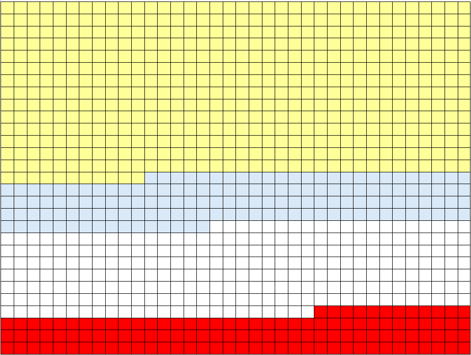
For those interested, here is mine as February 2026, aged 42. Yellow represents life lived. Blue resembles the point in which William (my youngest) remains a child. And red represents a period of life when I may not be able to do the things that give my life meaning and purpose: